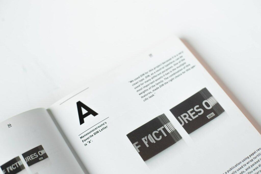
In the realm of design, the “Readability of fonts” is a topic that often sparks intense debates among designers and typographers. While aesthetics play a crucial role in capturing the viewer’s attention, readability ensures that the message is conveyed clearly and effectively. Striking the right balance between these two elements can be challenging, but it’s essential for creating impactful and user-friendly designs.
The Importance of Font Readability
When it comes to typography, readability is paramount. It’s not just about choosing a font that looks good; it’s about ensuring that the text is easily legible and comprehensible to the reader. A design might be visually stunning, but if the audience struggles to understand the content due to poor font choices, the design’s purpose is defeated.
There are several factors that influence the readability of a font. These include the font’s size, weight, spacing, and contrast against its background. For instance, the usage of certain fonts can decrease formality and readability, making them unsuitable for professional or academic contexts.
Aesthetics in Typography
While readability is essential, aesthetics shouldn’t be overlooked. The visual appeal of a font can evoke emotions, set the tone of the content, and enhance the overall user experience. For designers, it’s about finding a font that aligns with the brand’s identity and the message they want to convey.
However, aesthetics can sometimes overshadow readability. It’s not uncommon to come across designs where the font is so stylized that it becomes challenging to read. In such cases, the design loses its effectiveness, as the audience might not engage with the content as intended.
Balancing Aesthetics and Readability of Fonts
To achieve a harmonious balance between aesthetics and readability, designers must consider both elements equally. Here are some tips to ensure that your typography serves both purposes:
- Test Your Fonts: Before finalizing a font, check its readability across different platforms and devices. Tools that allow you to “check readability of font” can be invaluable in this process.
- Consider the Context: A font that works well for a fashion magazine might not be suitable for a technical report. Always consider the context and audience when choosing a font.
- Prioritize Legibility: While it’s tempting to choose a font solely based on its visual appeal, always prioritize legibility. Remember, the primary purpose of text is to convey a message.

Exploring Different Font Styles
The world of typography is vast, with a plethora of font styles available for designers to choose from. Each font style carries its own personality and can significantly influence the mood and tone of the content.
Serif vs. Sans Serif
One of the most common distinctions in typography is between serif and sans serif fonts. Serif fonts, characterized by small decorative lines or “feet” at the end of letters, often exude a sense of tradition and formality. They are commonly used in print media, such as newspapers and books. On the other hand, sans serif fonts, which lack these decorative lines, offer a cleaner and more modern look. They are frequently used in digital media due to their clarity and readability on screens.
However, the debate over which is more readable, serif or sans serif, is ongoing. While some studies suggest that serif fonts are more readable in long-form print content, others argue that sans serif fonts are more legible on digital screens.
Script and Decorative Fonts
Script fonts mimic cursive handwriting and can add a touch of elegance and sophistication to a design. They are often used for invitations, logos, and headers. However, they should be used sparingly and never for long blocks of text, as their readability can be compromised.
Decorative fonts, as the name suggests, are designed primarily for decoration. They can be playful, quirky, or abstract. While they can make a design stand out, they often sacrifice readability. It’s essential to use decorative fonts judiciously and ensure that they don’t hinder the content’s legibility.
The Role of Color and Contrast
Beyond the font style, the color of the text and its contrast against the background play a pivotal role in readability. High contrast, such as black text on a white background or white text on a dark background, enhances readability. On the other hand, low contrast can strain the eyes and make the content difficult to decipher.
When experimenting with color, it’s also crucial to consider color blindness. Avoid color combinations that are problematic for those with color vision deficiencies, such as red-green or blue-yellow.
The Future of Typography
With advancements in technology, typography is continually evolving. The rise of augmented reality (AR) and virtual reality (VR) introduces new challenges and opportunities for designers. In these immersive environments, the readability of fonts takes on a new dimension, as text can be displayed in three-dimensional spaces.
Moreover, with the increasing use of voice assistants and audio content, the role of typography might shift from visual readability to auditory comprehension. Designers will need to think about how text is translated into speech and ensure that the content remains clear and engaging.
Wrapping Up
The balance between aesthetics and the readability of fonts is a dance that every designer must master. While it’s essential to create visually captivating designs, it’s equally crucial to ensure that the content is accessible and understandable to the audience. By staying updated with the latest trends in typography and continuously testing and iterating, designers can craft content that is both beautiful and effective.
Typography is an art and science that requires a keen understanding of both aesthetics and readability. By considering both these elements, designers can create content that is not only visually appealing but also easy to read and understand. Whether you’re designing a website, a poster, or any other form of content, always remember the importance of the readability of fonts and ensure that your designs resonate with your audience.
